
Photo by Tyler Nix on Unsplash
Previously, I explored the basics of survival analysis.
In this post, I will continue that journey by fitting a gradient boosting model for survival analysis. Instead of assuming a linear relationship between the predictors and the log-hazard, a gradient boosting model can learn non-linear patterns and interactions between variables.
The example below uses a customer churn dataset. One important caveat: this dataset was not originally collected as a full survival dataset with a clearly observed start date, event date, and censoring process. I use tenure as the time variable and exited as the event indicator for demonstration purposes, but the results should be interpreted as a modelling exercise rather than as a definitive customer lifetime analysis.
Demonstration
In this demonstration, I will use this bank dataset from Kaggle.
Set Up the Environment
First, I will load the necessary packages.
pacman::p_load(tidyverse, lubridate, janitor, survival, survminer, censored, gbm, Hmisc)Import Data
Next, I will import the dataset.
I will clean the column names, remove identifiers that should not be used as predictors, filter out records with zero tenure, and convert categorical variables into factors.
The gbm algorithm cannot use character variables directly, so categorical columns need to be converted to factors before modelling.
Now, let’s start building the GBM model.
Model Building
For reproducibility, I will set the random seed before fitting the model.
set.seed(1234)

gbm_fit <-
  gbm(Surv(tenure, exited) ~ .
      ,distribution = "coxph"
      ,data = df
      ,interaction.depth = 2
      ,n.trees = 1000
      ,cv.folds = 5
      ,n.cores = 5)
Here, distribution = "coxph" tells gbm to optimize the Cox proportional hazards loss function. The model estimates a relative risk score rather than a direct survival probability.
I set interaction.depth = 2 to allow two-way interactions between predictors. If interaction.depth = 1, the boosted trees are stumps and the model behaves more like an additive model. I also use cv.folds = 5 to estimate the best number of trees through cross-validation, and n.cores = 5 to speed up the calculation.
If the distribution is not specified, gbm will try to infer a suitable distribution from the response. For survival modelling, I prefer to specify "coxph" explicitly so the modelling intent is clear.
gbm_fit_noDist <-
  gbm(Surv(tenure, exited) ~ .
      ,data = df
      ,interaction.depth = 2
      ,n.trees = 100
      ,cv.folds = 5
      ,n.cores = 5)
Distribution not specified, assuming coxph ...Now, let’s go back to the original fitted model.
gbm_fitgbm(formula = Surv(tenure, exited) ~ ., distribution = "coxph",
data = df, n.trees = 1000, interaction.depth = 2, cv.folds = 5,
n.cores = 5)
A gradient boosted model with coxph loss function.
1000 iterations were performed.
The best cross-validation iteration was 149.
There were 9 predictors of which 8 had non-zero influence.The printed output confirms the model specification, the number of boosting iterations, and how many predictors were used. This output does not provide conventional regression coefficients or p-values. For boosted tree models, interpretation usually relies on model performance, variable importance, interaction strength, and partial dependence plots.
We get the same output if we pass the fitted object to the print function.
print(gbm_fit)gbm(formula = Surv(tenure, exited) ~ ., distribution = "coxph",
data = df, n.trees = 1000, interaction.depth = 2, cv.folds = 5,
n.cores = 5)
A gradient boosted model with coxph loss function.
1000 iterations were performed.
The best cross-validation iteration was 149.
There were 9 predictors of which 8 had non-zero influence.Cross-Validation
The cross-validation curve helps us choose the number of trees. Too few trees may underfit, while too many trees may overfit.
best_iter <- gbm.perf(gbm_fit, method = 'cv')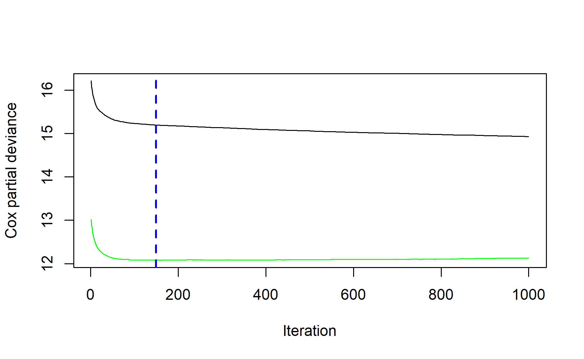
best_iter[1] 149The plot shows the cross-validated loss across boosting iterations. The blue dotted line marks the iteration with the best cross-validation performance.
Model Performance
A common performance metric for survival models is Harrell’s concordance index, or C-index. It measures whether the model correctly ranks subjects by risk. A value of 0.5 is similar to random ranking, while a value closer to 1 indicates better concordance.
Before calculating the C-index, we need to generate predicted values using the cross-validated number of trees.
gbm_predict <-
  predict(gbm_fit, df, n.trees = best_iter)
For a Cox GBM model, the prediction is on the log relative-hazard scale: a higher value means higher estimated event risk. The rcorr.cens function expects higher scores to indicate longer survival, so I multiply the prediction by -1 before computing the C-index.
rcorr.cens(-gbm_predict, Surv(df$tenure, df$exited))["C Index"]C Index
0.80961 This gives a quick sense of ranking performance. However, the score above is calculated on the same data used to train the model, so it is likely to be optimistic. For a production or research analysis, I would evaluate the model on a separate test set or use repeated cross-validation, and I would tune other hyperparameters such as shrinkage, interaction.depth, n.minobsinnode, and n.trees.
Interaction
The gbm package also includes a function for estimating the strength of interaction effects.
To do this, we specify the pair of variables we want to check.
For example, I would like to estimate the interaction effect between age and geography.
interact.gbm(gbm_fit, df, i.var = c("age", "geography"))[1] 0.04668534Alternatively, we can estimate interaction effects for all unique pairs of predictors.
var_list <-
  df %>%
  select(-c(tenure
            ,exited)) %>%
  names()

pairs <- combn(var_list, 2, simplify = FALSE)

interact_result <-
  map_dfr(
    pairs,
    ~ tibble(
      variable_1 = .x[1],
      variable_2 = .x[2],
      interaction = interact.gbm(gbm_fit, df, i.var = .x)
    )
  )

interact_result %>%
  ggplot(aes(variable_1, variable_2, fill = interaction)) +
  geom_tile() +
  theme(axis.text.x = element_text(angle = 45, hjust = 1))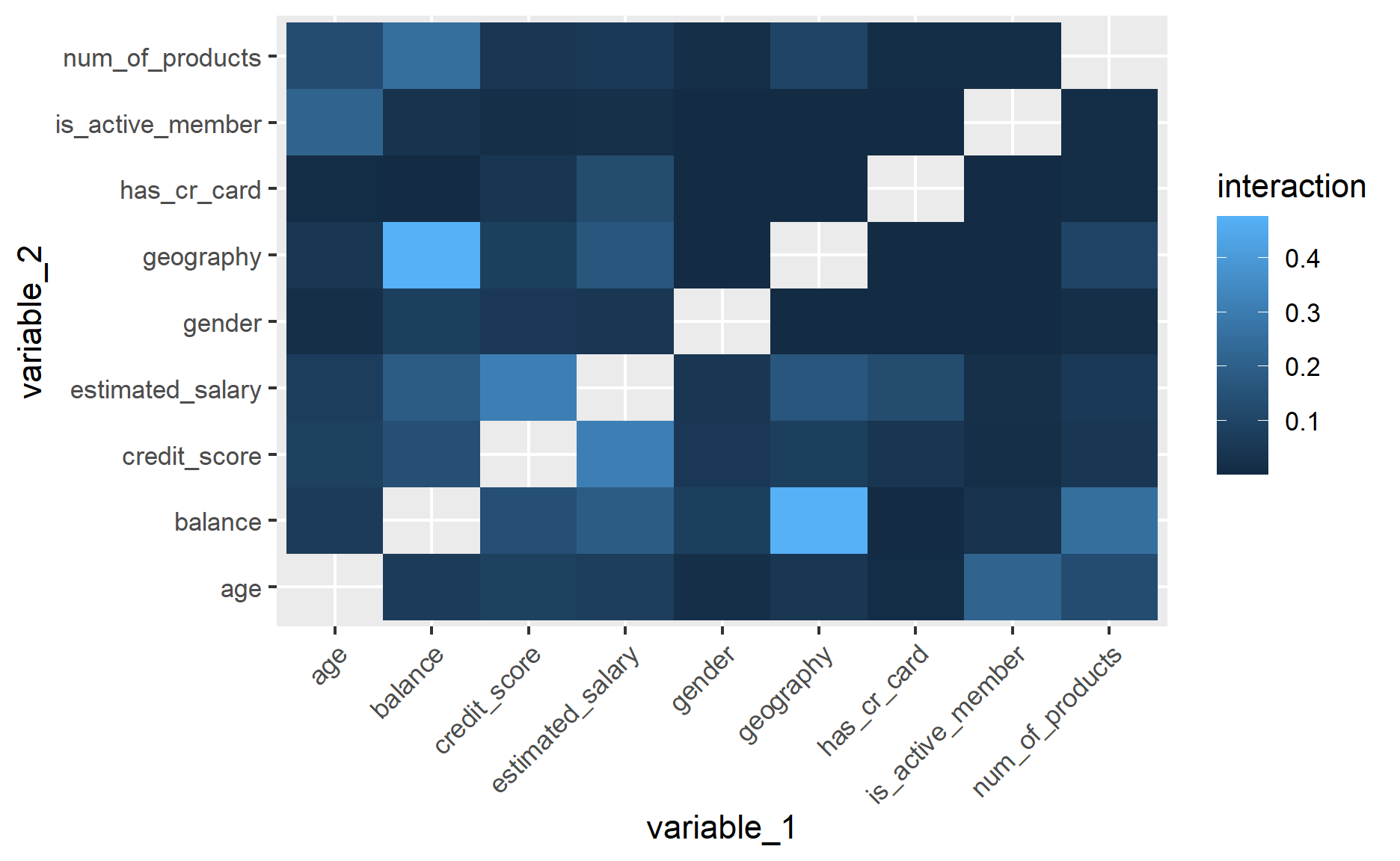
The larger the estimated value, the stronger the interaction signal. This is useful for exploration, but it should not be treated as a formal hypothesis test. It is also worth checking whether highly ranked interactions make business sense and whether they are stable across resamples.
Variable Importance
Another useful feature of the gbm package is that it estimates the relative influence of each predictor.
There are a few ways to obtain the variable importance results.
Method 1: Use summary function
summary(gbm_fit)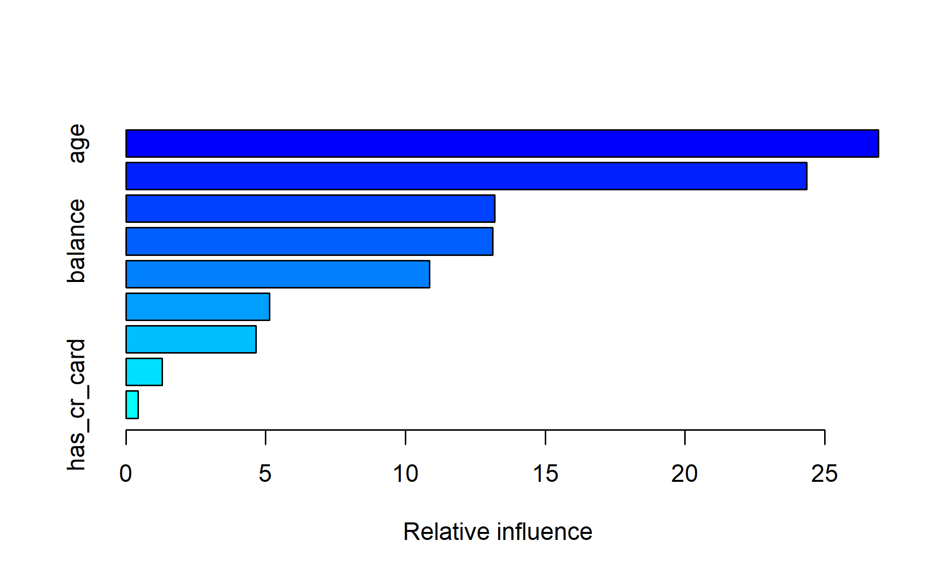
                              var    rel.inf
age                           age 26.9149738
num_of_products   num_of_products 24.3632770
credit_score         credit_score 13.2040099
balance                   balance 13.1281317
estimated_salary estimated_salary 10.8689779
is_active_member is_active_member  5.1401539
geography               geography  4.6517175
gender                     gender  1.2907075
has_cr_card           has_cr_card  0.4380509
Method 2: Use relative.influence function
relative.influence(gbm_fit)n.trees not given. Using 149 trees. credit_score geography gender age
72.72859 103.52181 37.78743 707.29663
balance num_of_products has_cr_card is_active_member
122.45139 629.82370 0.00000 166.83147
estimated_salary
55.72705 Personally, I prefer Method 2 because it is easier to pass the result to ggplot and customize the visualization.
as.data.frame(relative.influence(gbm_fit)) %>%
  rownames_to_column("variable") %>%
  rename(variable_importance = `relative.influence(gbm_fit)`) %>%
  ggplot(aes(variable_importance, reorder(variable, variable_importance))) +
  geom_col()
n.trees not given. Using 149 trees.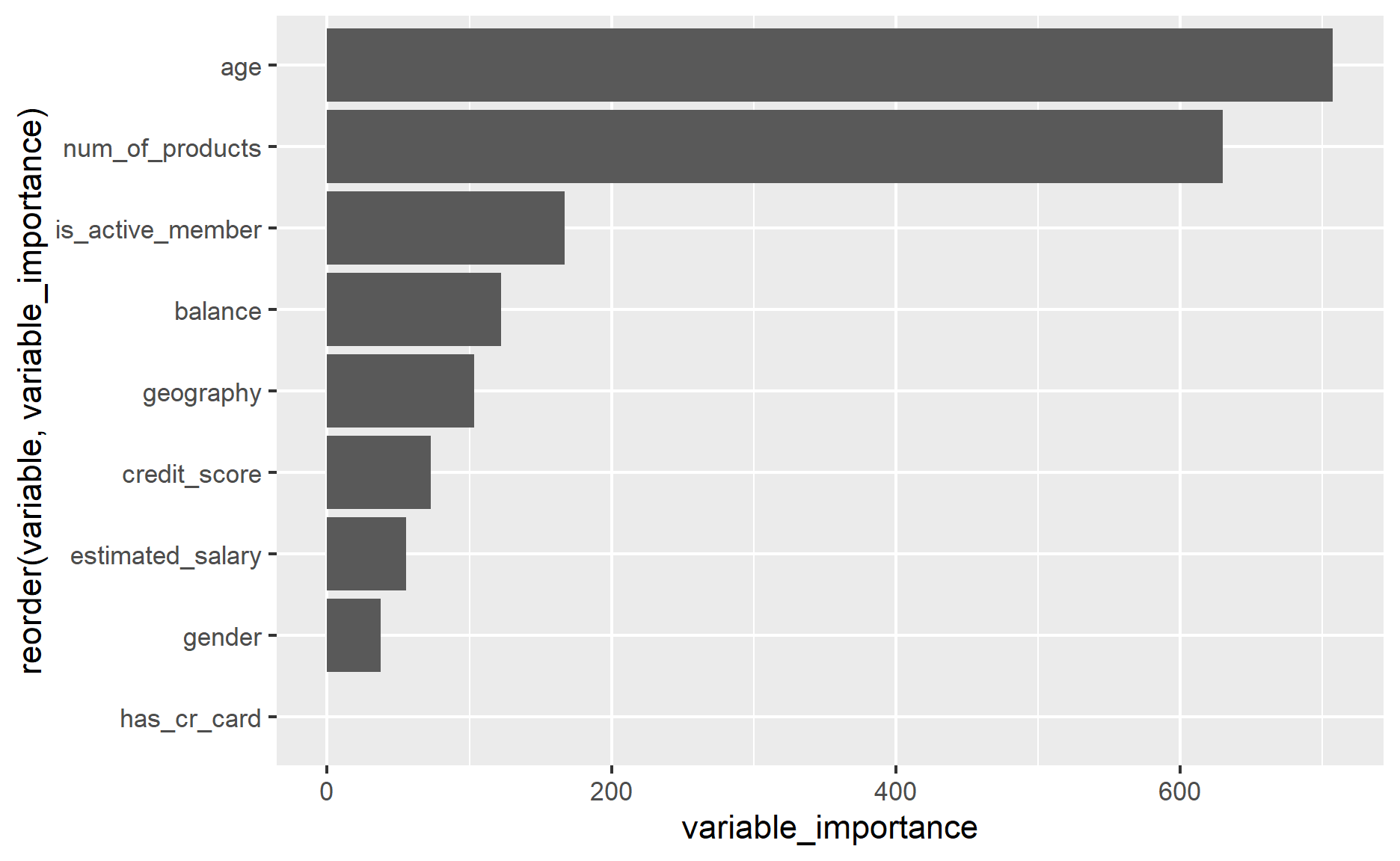
Variable importance is helpful for ranking predictors, but it does not show the direction or shape of each relationship. A variable can be important because its effect is non-linear, because it interacts with other variables, or because it acts as a proxy for another predictor. For that reason, it should be read together with partial dependence plots, interaction checks, and domain knowledge.
Partial Dependence
The gbm package can generate partial dependence plots to help us understand the marginal relationship between a predictor and the model’s estimated risk score.
plot(gbm_fit
     ,i.var = "age")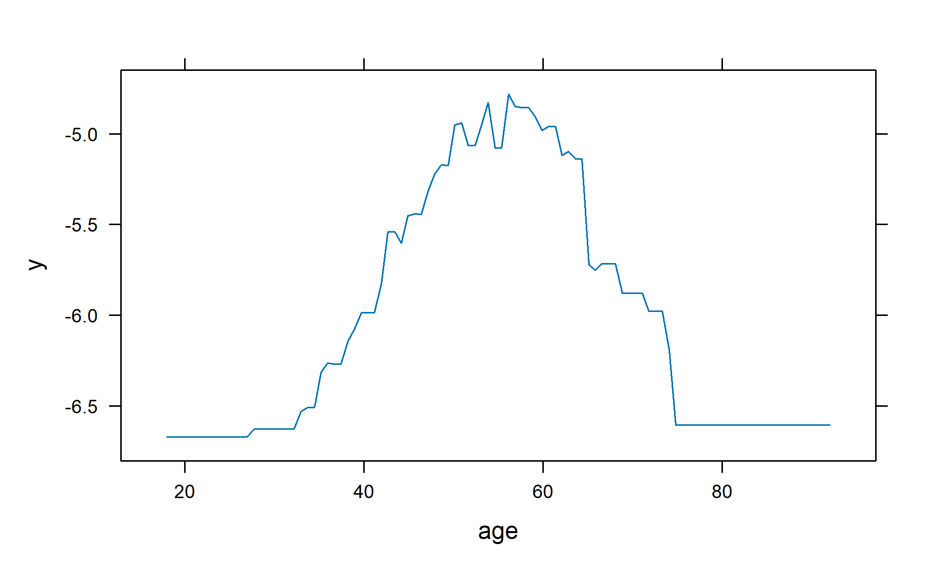
However, I prefer using ggplot to create the chart.
Therefore, I will specify return.grid = TRUE so the function returns the estimated values.
plot(gbm_fit
     ,i.var = "age"
     ,return.grid = TRUE) %>%
  ggplot(aes(age, y)) +
  geom_line() +
  ylab("") +
  labs(title = "Partial Dependence Plot for Age") +
  theme_minimal() +
  theme(axis.text.y = element_blank()
        ,axis.ticks.y = element_blank())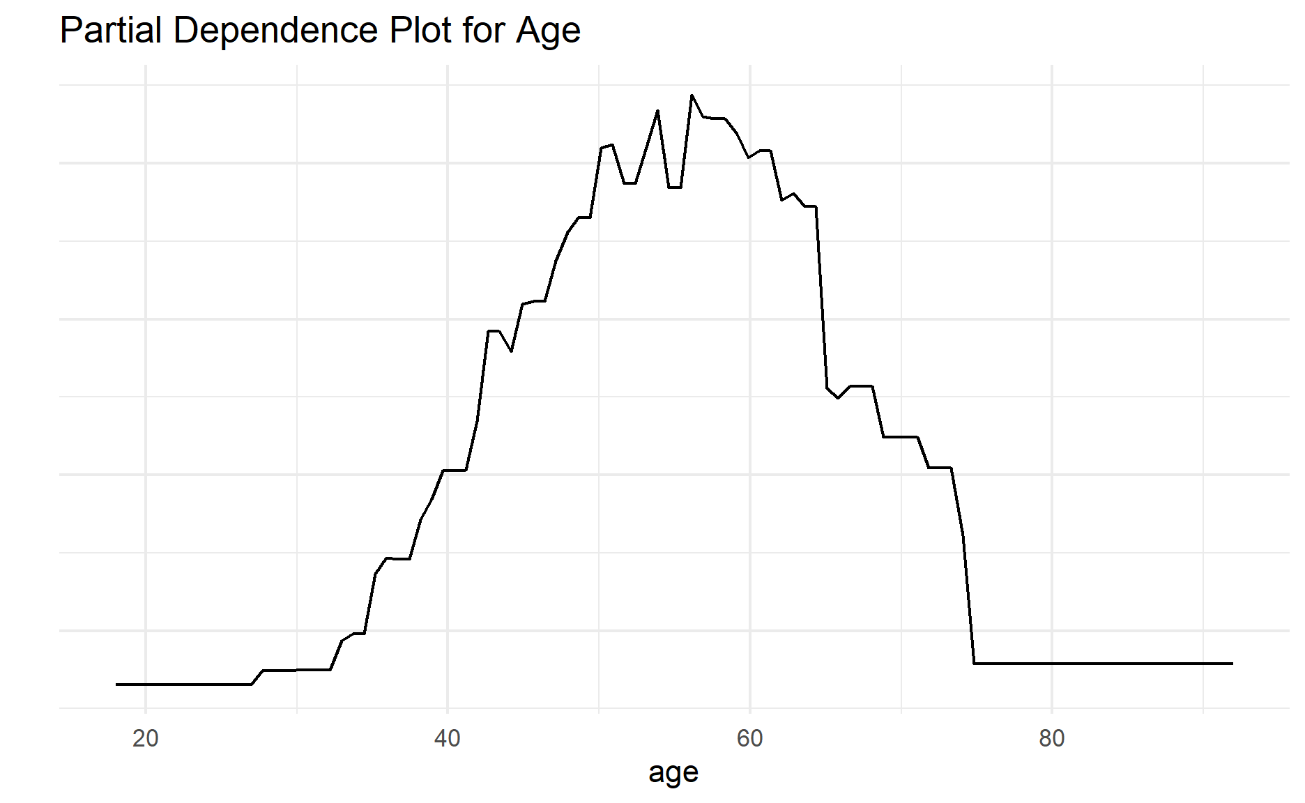
If we would like to compute partial dependence for more than one variable, we can pass multiple variables to the i.var argument.
# partial dependence of two variables
plot(gbm_fit
     ,i.var = c("balance", "geography")
     ,return.grid = TRUE) %>%
  ggplot(aes(balance, y, color = geography)) +
  geom_line() +
  ylab("") +
  labs(title = "Partial Dependence Plot for Balance and Geography") +
  theme_minimal() +
  theme(axis.text.y = element_blank()
        ,axis.ticks.y = element_blank())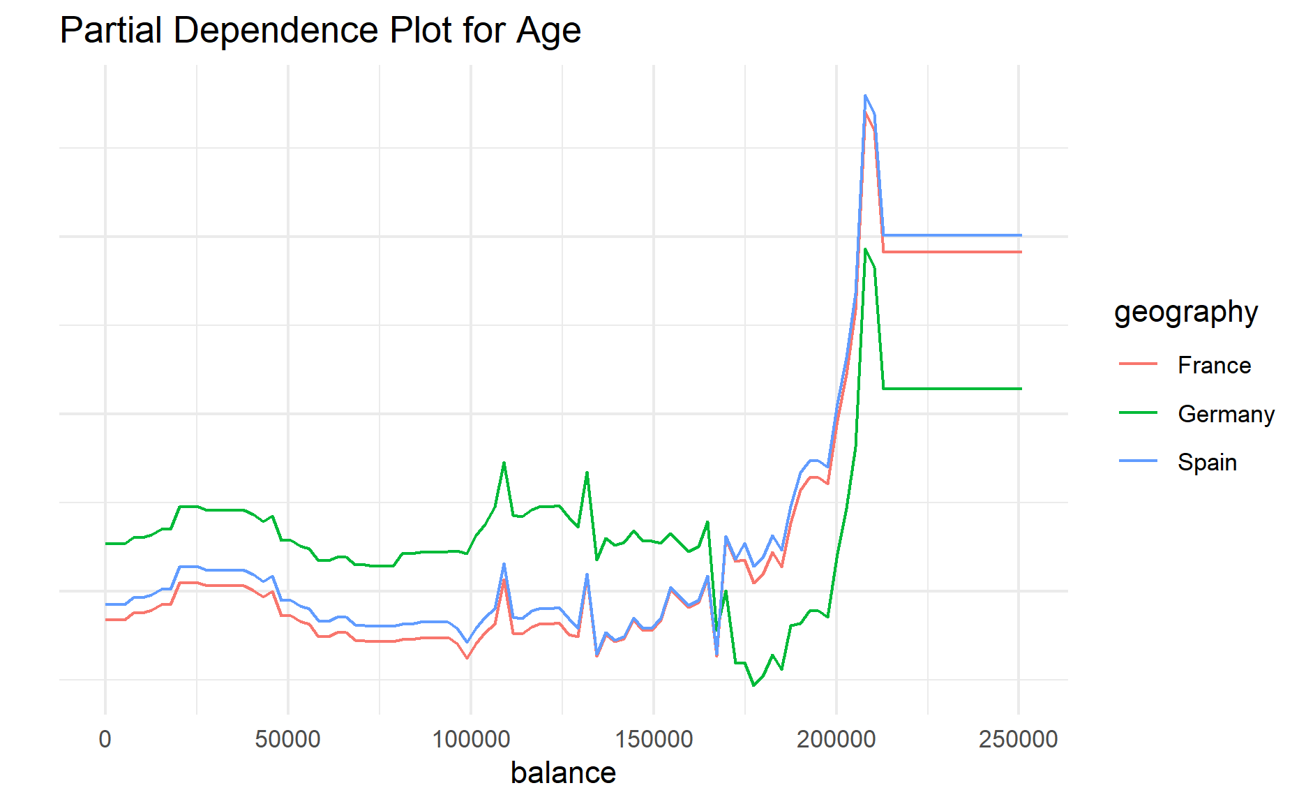
Partial dependence plots are useful, but they should be interpreted carefully. They show the average model response after varying selected predictors, which means they may be misleading when predictors are strongly correlated or when some combinations of values are unrealistic.
That is how GBM can be used to perform survival analysis.
Conclusion
In this post, we fitted a GBM survival model using the Cox loss function, selected the number of trees using cross-validation, evaluated the model with the C-index, and explored the model using interaction strength, variable importance, and partial dependence plots.
The main point to remember is that survival modelling is not only about the algorithm. We also need to define the time origin, event indicator, censoring mechanism, evaluation strategy, and interpretation framework carefully. For this churn example, the dataset is useful for demonstrating the mechanics of a survival GBM, but a real customer survival analysis would require stronger event-time data and a more rigorous validation design.
That’s all for the day.
Thanks for reading the post until the end.
Feel free to contact me through email or LinkedIn if you have any suggestions on future topics to share.
Refer to this link for the blog disclaimer.
Till next time, happy learning!

Photo by RDNE Stock project